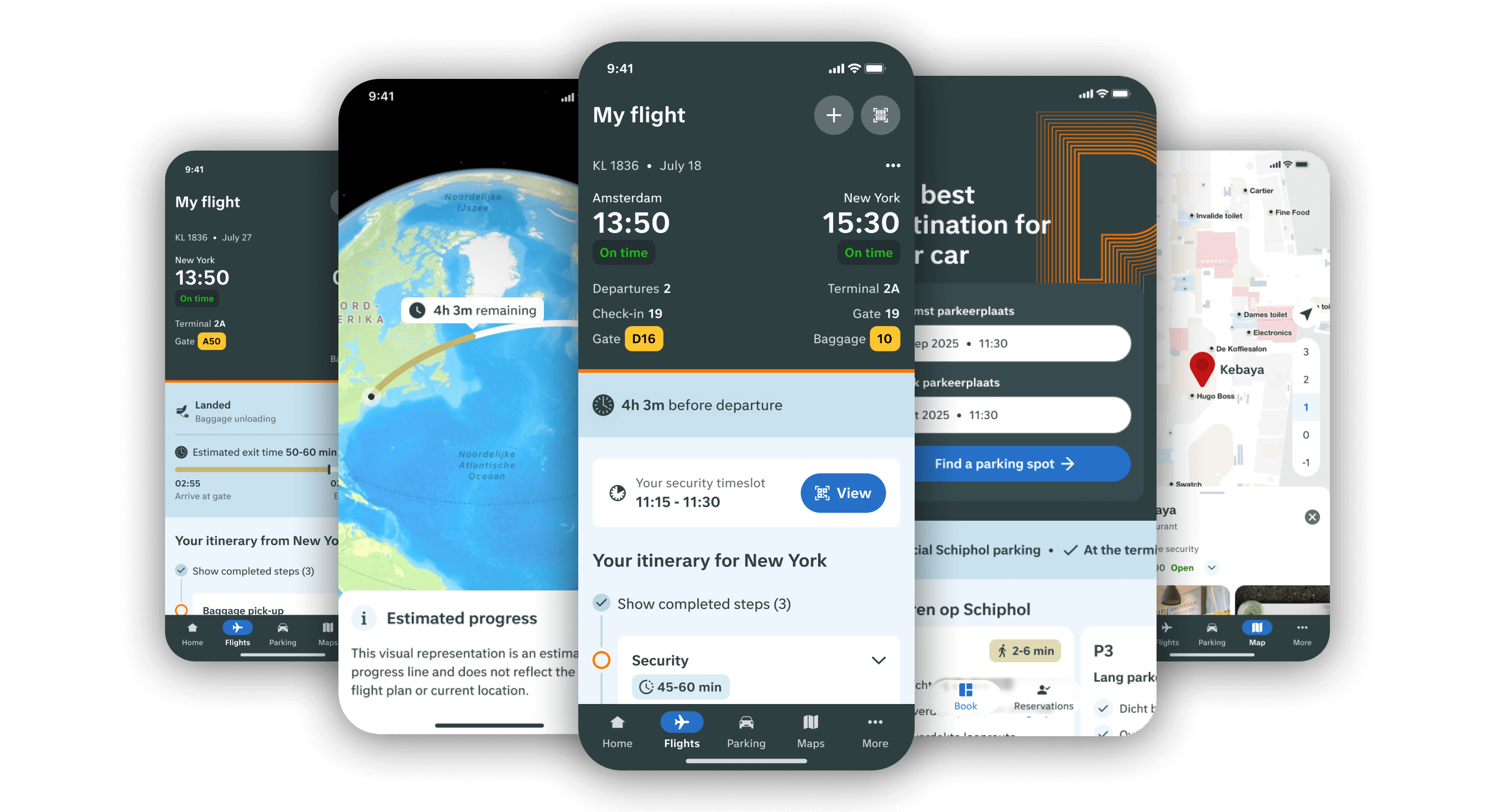
For the past three years, I’ve been designing for the Schiphol app, continuously optimizing its features to better meet the needs of our passengers. My work has also included designing for the Schiphol website and other digital channels. Here’s a brief overview of the Schiphol app.
Rating in the app store
Daily users
Downloads in 2024

Within our team, we work in an agile way and follow the Double Diamond design process. During the discovery phase, I collaborate with UX Researchers to gather insights and define the problem. Once the problem is clear, we set our goals and determine what we want to achieve. Throughout the process, from concepting to ideation, I closely involve our iOS and Android developers to ensure alignment, avoid surprises in development, and create solutions that truly meet user needs.
During the ideation phase, I often use usertesting to quickly validate concepts online. Once a concept proves promising, I fully design it and test it again, this time at the terminal with real users. These in-context tests provide valuable insights. We also run A/B tests in production to gather qualitative and quantitative data. After development, we ensure proper tracking is in place so we can monitor new features against our KPIs and continue improving where needed.

Beyond features like the parking funnel and digital map, our main goal is to give passengers a seamless journey through the airport. Research has shown that many passengers feel stressed as soon as they arrive, worrying about things like making their flight on time, finding their way, or how long security queues will be. Even after landing, questions remain: When will my baggage arrive? When should I tell my family to pick me up? And these are just a few examples of the many uncertainties passengers face along their journey.
When users download and open the app for the first time, we aim to guide them toward finding and saving their flight. Once a flight is saved, the app provides a clear, step-by-step guide with all the information passengers need for a smooth journey.
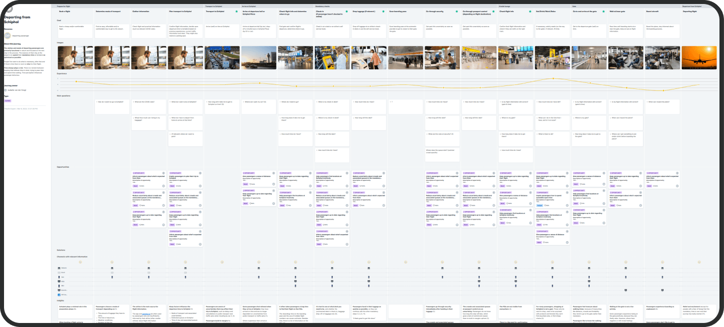
Extensive research went into mapping the complete passenger journey for departing, transferring, and arriving passengers helping us uncover key pain points to address. This is a glimpse of the departure journey:

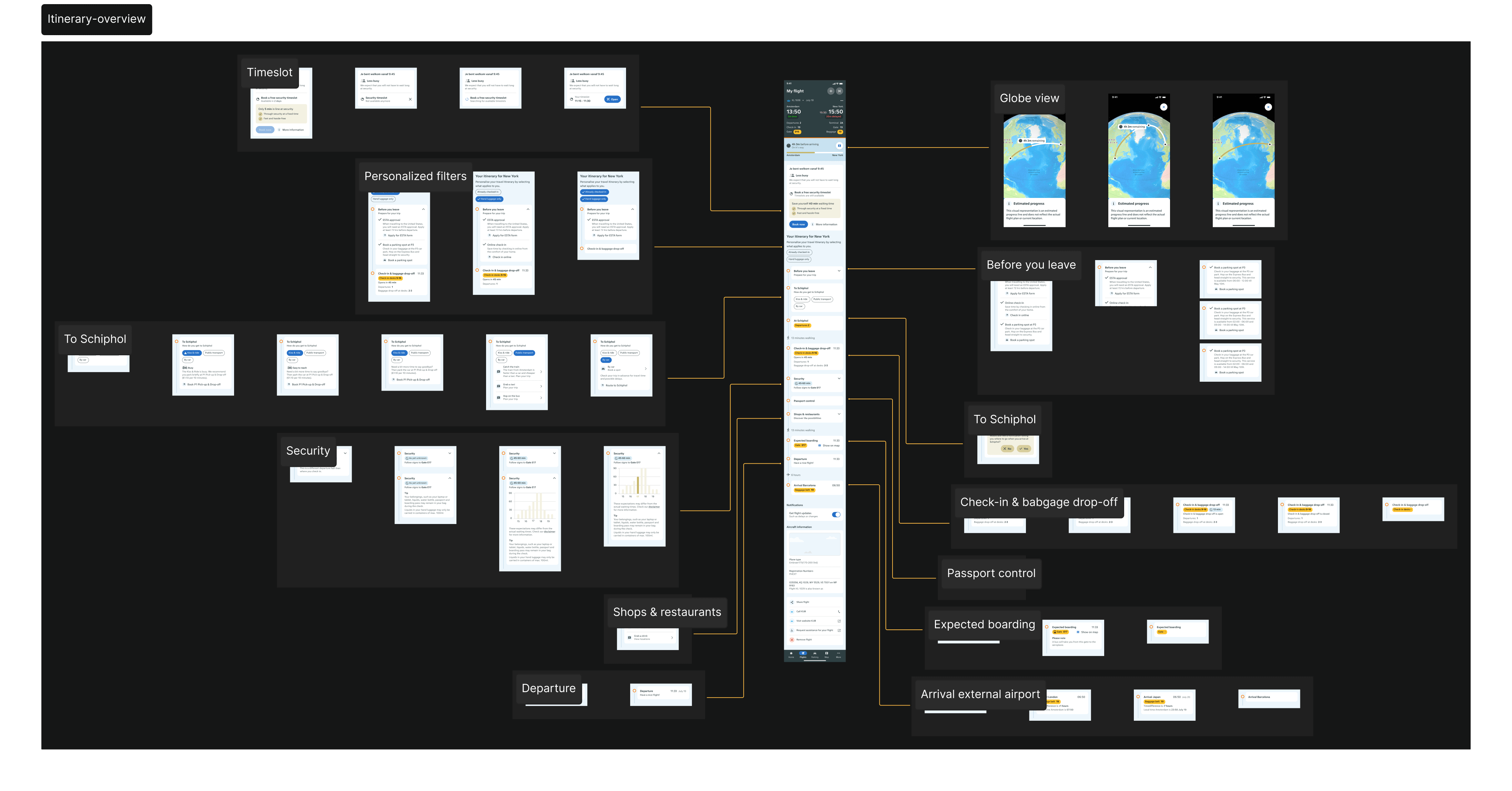
The build of the itinerary page is as followed
This is a complex page with many different states, designed to assist every type of passenger traveling through Schiphol. I can’t describe all the work here, but below are a few features explained in more detail.
A departure itinerary in Figma with all the different states.

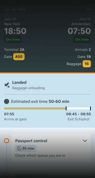
One of the biggest pain points for our arriving passengers is the lack of awareness about passport control waiting times and uncertainty about when their baggage will appear on the belt. Since COVID-19, Schiphol has aimed to become more predictive and aware of passenger flows in order to optimize operations. By adjusting capacity in real time, Schiphol can better streamline its internal processes. As part of these efforts, initiatives were launched to measure and predict passport control waiting times. Over time, baggage reclaim data (predictions of when passengers’ luggage will appear on the belt) also improved significantly.
With these newly available data sources, we were able to combine everything to calculate when we expect passengers to complete all mandatory steps and enter the arrival halls ready to meet their family and friends, or simply go home and order a pizza.
The calculation includes the following data:
We tested this feature both online and at the terminal. Feedback from passengers and those picking them up has been overwhelmingly positive — passengers appreciate no longer having to calculate these times themselves.
Time to exit in the app

Within our team, we continuously follow the latest developments to stay ahead of the game. For several years, we’ve had a watch app for iOS. Recently, we updated all our widgets and complications to ensure a consistent design and experience across all devices. And the big news: we now have live notifications in the app — a key feature that brings essential flight information directly to the user’s lock screen (on both iOS and Android).
Key information plotted on the passenger journey

Since widgets and live notifications offer limited space to display information, it’s crucial to understand which data is most important to passengers at any given moment. Together with a UX researcher, we went to the terminal and interviewed passengers at every stage of their journey to learn what information matters most at each moment.
With this exercise, we gained valuable insights that allowed me to start designing the live notifications. For both the departure and arrival journeys, we created live notifications that display key information for our passengers.

Once that puzzle was solved, we were able to apply the same approach across all our widgets. Whether you’re using your watch or your phone and no matter the widget size (rectangular or circular), we always aim to display the most valuable information.
Below you see some examples of our widgets on the lockscreen (left) and watch (right)

Besides the value we aim to provide to our passengers, we also want the app experience to be delightful. Function always comes before fancy, but it’s nice to put in a little extra effort to make it more pleasing to the eye. At the bottom of every added flight, we designed custom aircraft illustrations featuring the correct airline branding. We analyzed the most frequently flown aircraft at Schiphol and, based on that, created a top 10 list of aircraft types, which I then illustrated.

![event layouts and seating charts [digital project]](https://cdn.prod.website-files.com/68dd6c9f5c8c9b1c39eb74b6/68df87939c282fcced7e2b3a_Rebranding%20-%20featured%20image.png)