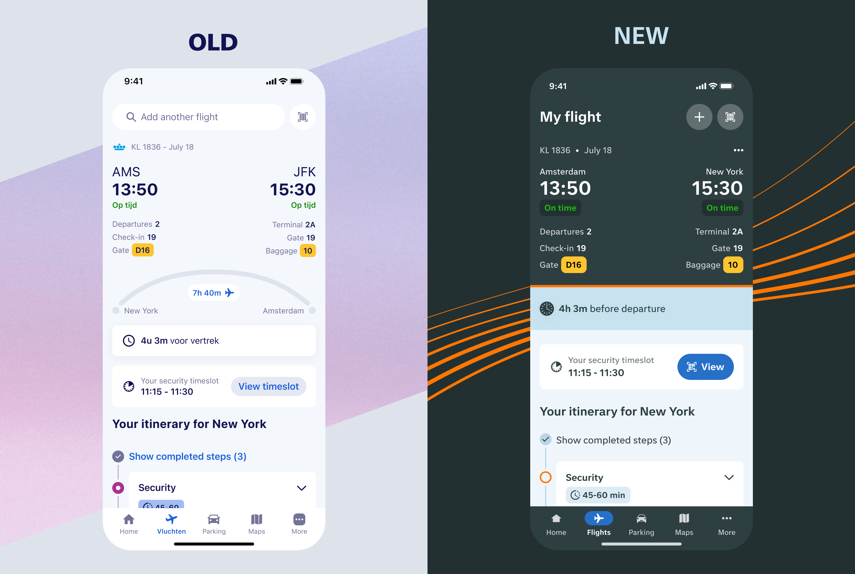
We didn’t just update the visual look of the app, we also built an entirely new design system. In this case study, I walk through the steps I took to create it and highlight the key benefits it brings.
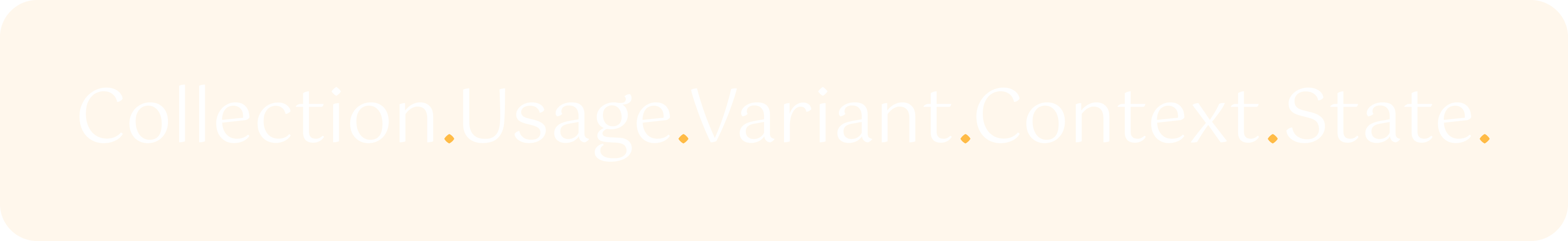
When I set up the design system, my main goal was to create a foundation that was clear, flexible, and scalable. To achieve this, I used a hierarchical semantic token naming system, a structured way of naming design tokens so that their purpose is always clear and they can grow with the product over time. Instead of giving things short but vague names (like btn_primary_bg), or relying only on utility classes (like bg-primary), I wanted a system that balances clarity with flexibility. That’s where semantic token naming shines: each token name tells you what it’s for, where it’s used, and how it behaves, without needing extra documentation.
Each token follows the same structure:
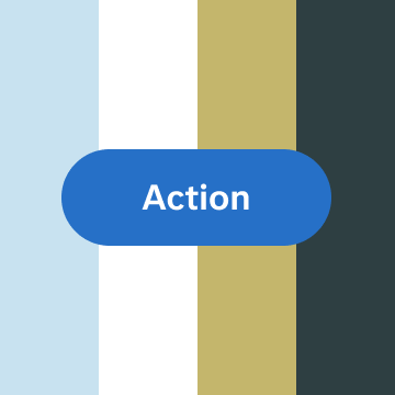
To show how this approach works in practice, let’s look at a button. Buttons are one of the more complex elements in our design system, which makes them the perfect example. Thanks to the hierarchical semantic token naming, our tertiary button can adapt seamlessly to different surfaces and states. Each token name makes it clear what the style is for and how it behaves, which keeps the system flexible and scalable.
color.fill.action.tertiary.on-base.enabled

color.fill.action.tertiary.on-plain.enabled

color.fill.action.tertiary.on-accent.enabled
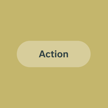
color.fill.action.tertiary.on-contrast.enabled
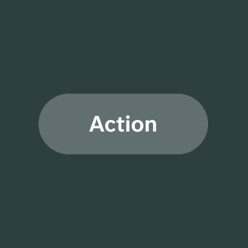
Ideally, a single button style would work across all surfaces. In reality, though, this isn’t always possible, especially when branding guidelines and contrast requirements come into play. That’s why our tertiary button needs multiple tokens to adapt to different contexts.
Our primary button, on the other hand, is much simpler. Its design works consistently across all surfaces, so it only requires a single token. In this case, there’s no need to define the context, since the button always looks correct no matter where it’s used.
color.fill.action.primary.enabled
A glimpse of our color tokens
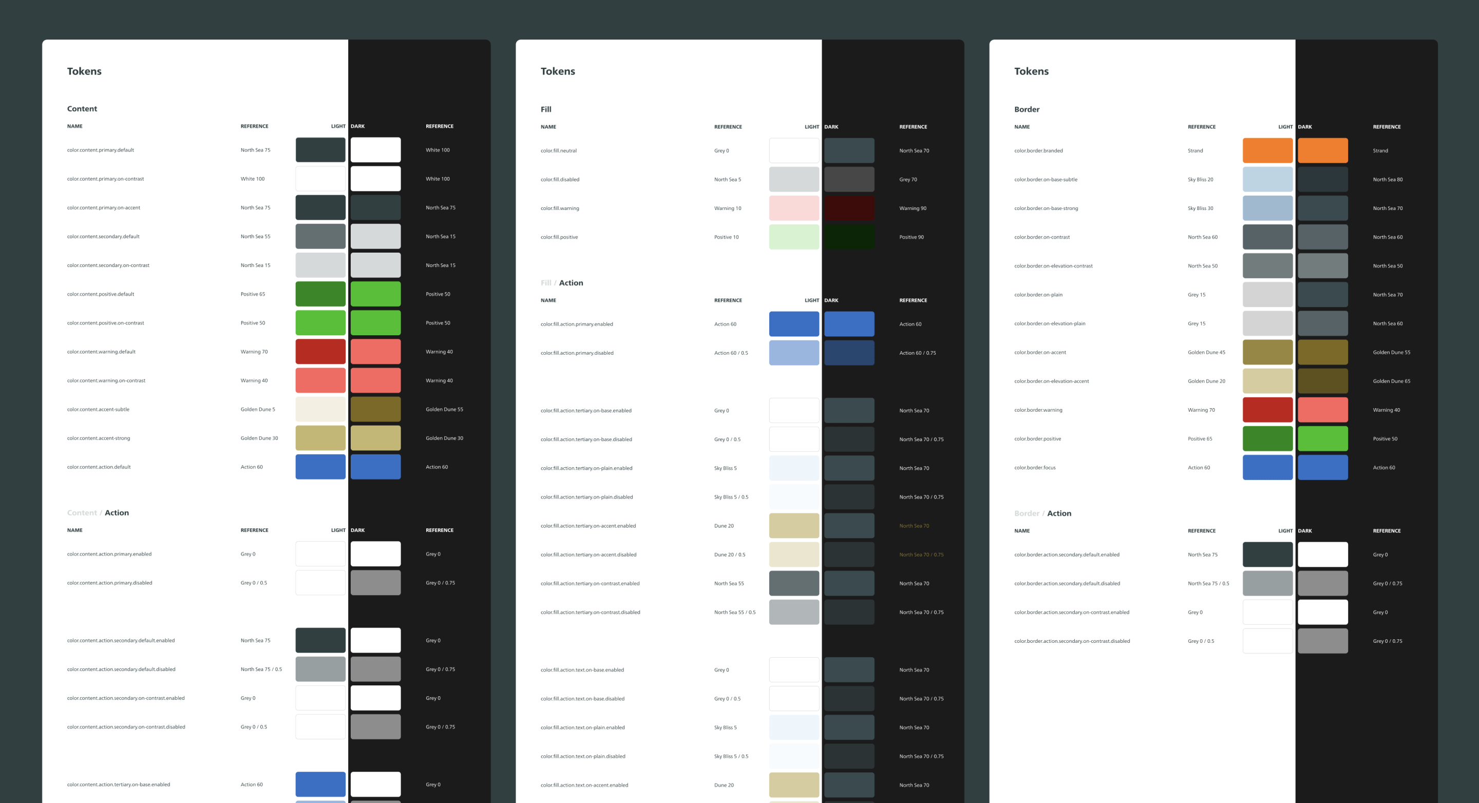
A single button token is just one piece of the puzzle. A button doesn’t only have a background color, it also contains text, sits on an elevation, and that elevation rests on a surface. And those are only the color tokens. Our design system defines tokens for many other variables, including:
When all these tokens come together, they form a consistent, flexible, and future-proof system. At Schiphol, we manage all tokens and variables in Token Studio, which acts as the bridge between design and development. From there, tokens are exported into Figma as variables and synced with GitHub, ensuring we have a single source of truth that can be updated in one place.
The value of this approach is twofold:
This page only scratches the surface, there’s much more to share about the process and the benefits of building this system. I’d be happy to dive deeper and discuss it further.
![event layouts and seating charts [digital project]](https://cdn.prod.website-files.com/68dd6c9f5c8c9b1c39eb74b6/68e8c3a6e3531c093074df33_app%20hero.png)